“R” is for Rachelle.
Playing with type using only the letter "R" for Rachelle becomes a focused and creative exercise in transforming a single letter through unconventional materials and techniques. By shaping "R" out of items that are closely personal , each rendition of the letter takes on new life and personality. When hand-crafted, these "R"s carry an organic, tactile feel, highlighting the individuality of each piece. Photoshop can enhanced these designs, enabling combinations of textures and surreal effects, so each "R" reflects a different mood and style—from playful and vibrant to elegant and polished.

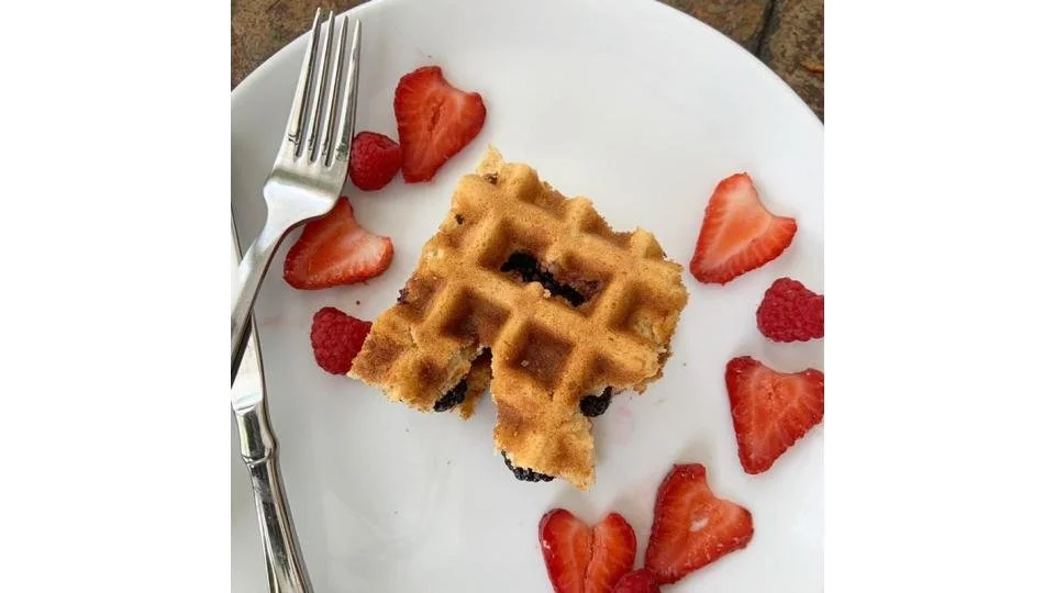
The “R” Waffle
Creating the letter "R" out of a waffle for Rachelle would be a meaningful nod to her personal journey with food and cooking. Since waffles were the first vegan recipe she mastered, using them to form an "R" would symbolize her beginnings in the culinary world. The texture and grid pattern of a waffle could be shaped or carved into a bold "R," either crafted by hand using the waffle. This design would capture the warmth of her story, showcasing how a single food sparked her love for crafting dishes that are both creative and healthy.
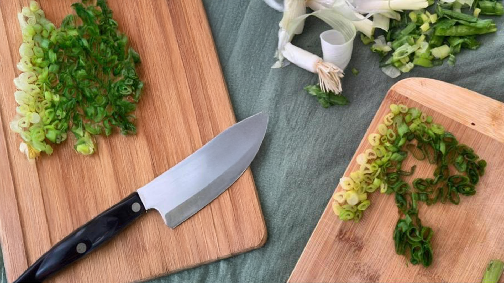
Green Onion Ombre “R”
A Green Onion Ombre "R" would be a fresh and visually striking take on the letter, blending natural shades from deep green at the top to lighter, softer greens at the base. By carefully arranging green onion stalks, you could create a gradient effect, capturing the range of colors within each stalk. The top part of the "R" would start with the darker, richer green sections, transitioning gradually to the lighter, almost translucent green near the ends. Whether laid out by hand or arranged digitally, this approach would celebrate the organic beauty of food and connect to a healthy, earthy vibe that aligns with Rachelle's culinary journey.
The “R” out of Film
Creating an "R" out of camera film would be a perfect tribute to Rachelle's roots in modeling and film work, which sparked her journey into content creation and art direction. The film could be arranged in a flowing or structured way, using its dark tones, perforations, and reflective qualities to form the shape of the "R." This design would celebrate her artistic beginnings, merging the technical and creative aspects of her career and giving the "R" a cinematic, vintage feel.


